Desktop thread, Febuary 2005

Here are my 3, resized so i don’t rape the board’s tables. Click them for fullsize:

<a href=“http://home.comcast.net/~noinu/flcllayout.bmp”>
<img src=“http://img.photobucket.com/albums/v470/devillion/flcllayout.bmp”></a>
<a href=“http://home.comcast.net/~noinu/iidxlayout.bmp”>
<img src=“http://img.photobucket.com/albums/v470/devillion/iidxlayout.bmp”></a>
<a href=“http://home.comcast.net/~noinu/gradiiuslayout.bmp”>
<img src=“http://img.photobucket.com/albums/v470/devillion/gradiiuslayout.bmp”></a>

And some cool cursor sets i made. You can’t see them in the screenshots, but i use the FLCL one in the Feel Orange layout, and the poring-ish one in all the others:

<img src=“http://img.photobucket.com/albums/v470/devillion/cur2.bmp”>
<img src=“http://img.photobucket.com/albums/v470/devillion/cur.bmp”>

cool.
I’d pick the middle or bottom one.

Argh! <EM><B>DON’T</EM></B> just use tags to resize your images!

Oh, and I’d hit the middle one.

I love this one. :slight_smile:

  1. Don’t resize with tags. Make a different image. Resizing in tags does little good because we still have to load the 10 gig image.
  2. Don’t use BMPs as your image. JPGs, GIFs for the thumbnail, and possibly PNGs for the large scale.
  3. My desktop kicks your desktop’s ass

I like the 1st one

I’m going to have to agree with xelopheris. That’s an awesome one

Oh a desktop thread. I switch off between a variety of them, all of them made by me in Photoshop through manipulation of multiple images. These have been resized so as not to kill bandwidth. I’ll put up my favorites. Let’s see…

I love this one to death except for the fugly black line in the bottom right area. Normally it’s not a problem since the start menu covers it but still it annoys me.

I do like Sesshomaru. Only thing I dislike about this desktop is the CnP is a little raggedy on his hair, the pommel of Tokijin, and his furry thing (whatever that is o.O).

I oftentimes found myself thinking “What a team they’d make if only they would get it into their skulls to work together.” So I made this.

I made this when I first got WoW. It’s amazing how bad a screen-captured cinematic looks, so I had to do extensive brightness/contrast, color, glow, and blur formatting on the crouching Night Elf. It still looks pretty good, even full-sized.

Hope all this didn’t kill anyone’s loading times. =D
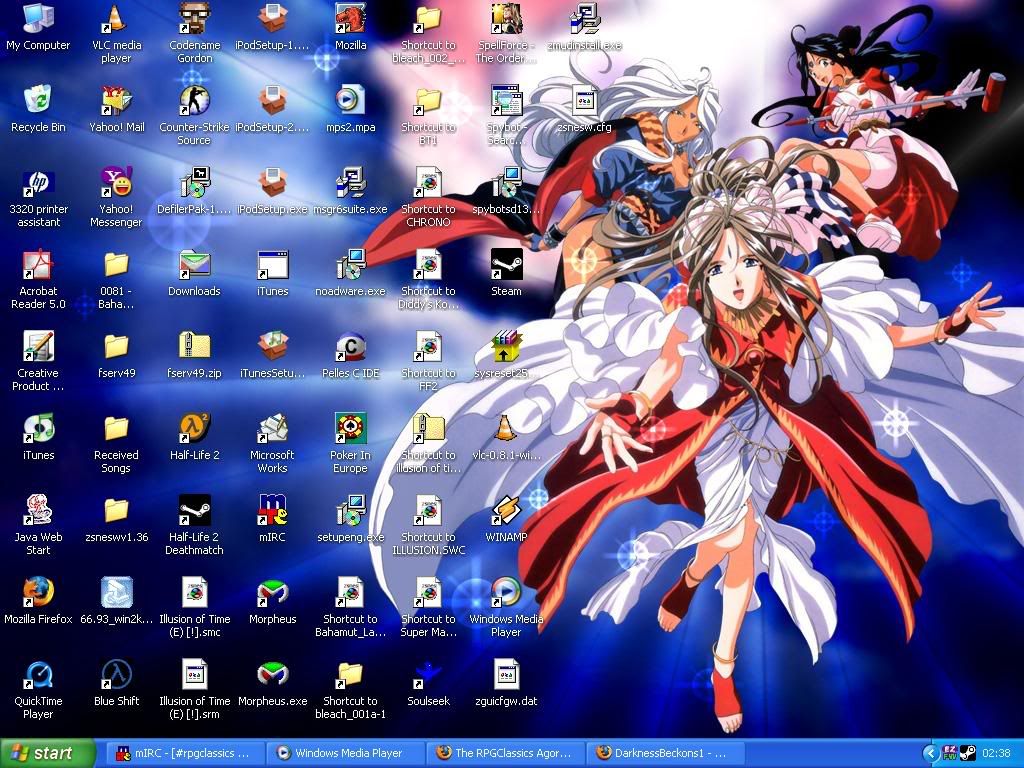
Xelo: Not really a KDE man, myself :stuck_out_tongue: Nice paper though.

And sorry about that =(, they are individual images now.

Heh not really. I have plenty of other desktops, those are just my favorite ones.

<img src=“http://hades.nulani.net/images/napoleon.jpg”>

I’ve been using the same one for quite some time, but recently changed. Enjoy.

I had this one very briefly, early in the month, but it made a lot of my icons to hard to see, so I switched to this awesome FFVI one.

Hope it’s not to risque for the boards. If it is I’ll take it off as soon as someone warns me.

Lex wins

EDIT: Removed link to an old website I once had.

Is that the art of Adam Hughes I spy? Good taste that man.

Mine doesn’t look nearly as cool in a smaller size: